Visualising densities in R
Sean van der Merwe
Introduction
Symmetric location scale distributions
- We have central limit theorems in statistics that tell us that things in nature that are sums or averages tend to follow a normal distribution, at least in the limit, if some assumptions hold (including i.i.d. and finite variance).
- While the assumptions will never hold perfectly for real data, we often see patterns that are close enough for the deductions to still work.
- When the assumptions fail systematically then we end up with different distributions.
- As long as the model is good then the residuals should still be symmetric though, so let’s look at some distributions that are close to normal but not quite the same.
Built into R
- R has many distributions already built in, and we will stick to those today.
- There are hundreds of packages that load more distributions.
- You can code other distributions in R to your heart’s desire.
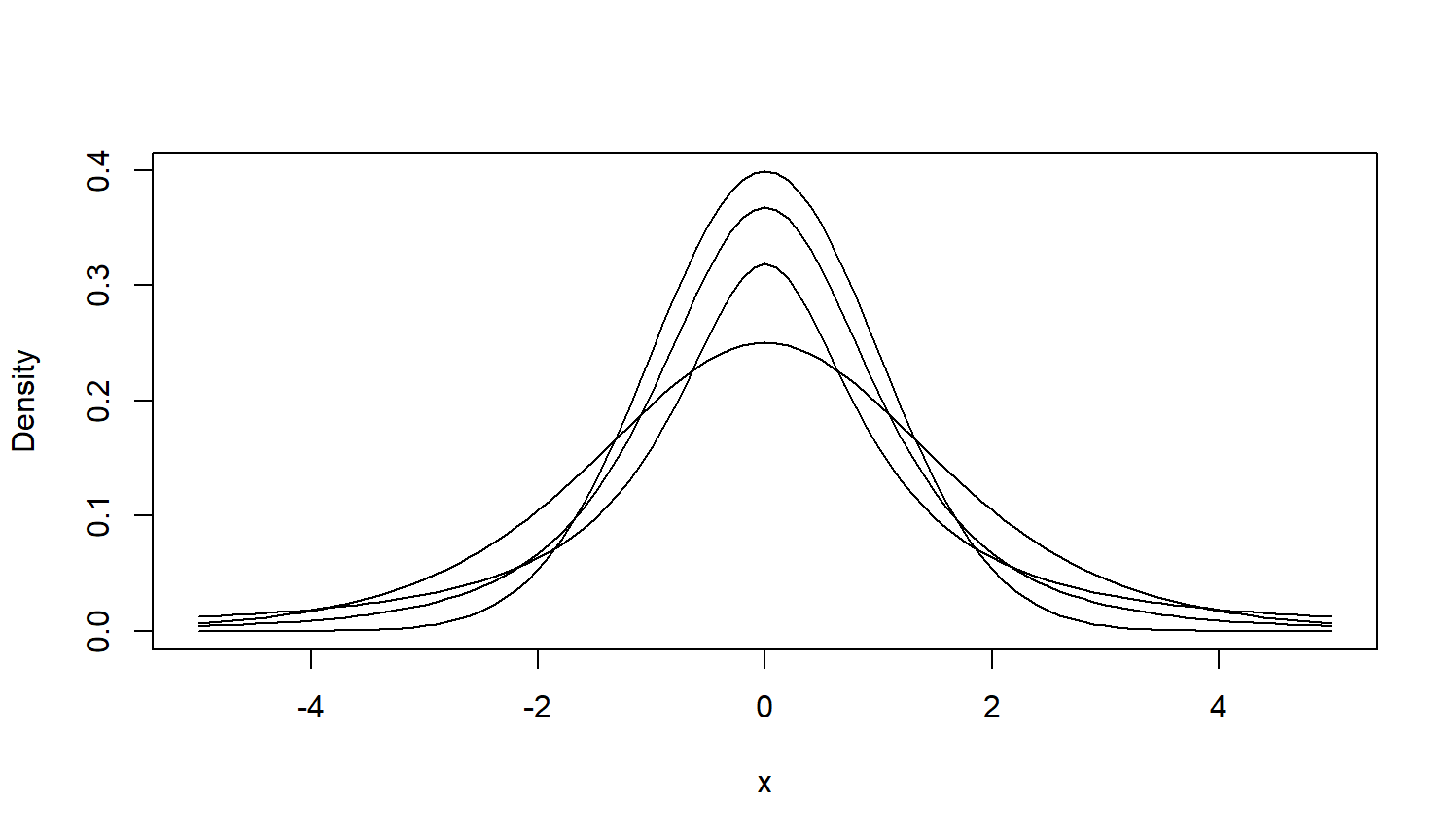
We will look at the normal, Student-t, logistic, and Cauchy to start.
Plotting functions
Curve function
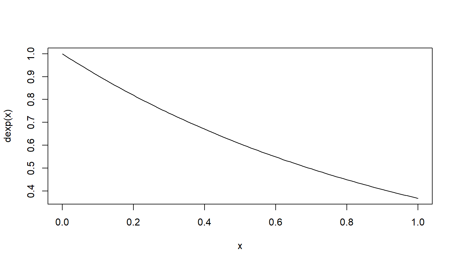
To draw a basic plot of a density function, we take the built-in density function function and supply it to the curve function.

Multiple curves
Let’s draw some curves over a fixed domain, adding the subsequent ones to the first one.

Long form
Alternatively, we can explicitly calculate the densities and put the calculated values in a data frame for storing and plotting.
Plot density table
- For an interactive plot, for presentations, we can use plotly.
- For a static plot, like for publications, we would typically use the ggplot2 package.
- Both require the data in long form for easier plotting.
- Let’s consider the code first.
Interactive plot
2024/07/25 Visualising densities