Generating data for assignments using R
Introduction
When you give students simulated data then you know the right answers up front (real data has issues). Simulated data that looks and sounds like real data is the best, both for assignments and for research. It should not be difficult.
Outline
- Basics of simulating in R
- Writing to Excel the proper way
- Multiple data sets
- More interesting simulations
Basics
Simulating from distributions
Simulating categorical data
Example: Let’s shuffle a deck of cards
deck <- paste( c(2:10, 'Jack', 'Queen', 'King', 'Ace') |> rep(times=4), 'of',
               c('Spades','Diamonds','Clubs','Hearts') |> rep(each=13) )
# To draw a hand of 7 cards:
hand <- deck |> sample(7)

# Shuffling is taking a sample the same size (52) without replacement:
shuffled_deck <- deck |> sample(length(deck))

# To do a bootstrap sample just add: , TRUE
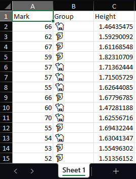
Generate and save

Writing to Excel nicely
You might think, “Let me make it look nice manually by opening it in Excel,” but they you decide to generate new data and you have to repeat those steps, again and again, and then you’re going to ask yourself, “Why didn’t I just make this part of the code?”
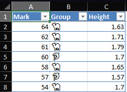
Let’s make our sheet look better

You can go much fancier than this. The openxlsx and openxlsx2 packages allow for crazy customisation.
Multiple data sets
Excel workbooks can have many sheets, there is no need to write to different files each time.
Give every student their own data set
- Students like to ‘work together’
- Unfortunately not in a good way
- Instead of collaborative learning, it often degenerates into one person doing all the work (and thus all the learning)
- Partial solution: randomised assessment
- I’ve been a driver of randomised assessment since 2006
- Started with WebCT (previous name for Blackboard) ‘Calculated’ questions.
- R exams package makes it easy to generate a BB quiz with different numbers for every student
- Still automatic marking!
Cycling through students
We only need about 3 more lines of code 😊
students <- c('2024000001', '2024000002', '2024000003', '2024000004',
              '2024000005') # Get class list in R somehow
# You can read student numbers from class list / mark list file:
# students <- openxlsx::read.xlsx('mark_list.xlsx', startRow = 4)$Student.ID
n <- 100
students |> lapply(\(s) {   # Make a list of data frames
  data.frame(
    Mark = rbinom(n, 100, 0.6),
    Group = c('🐬', '🐪') |> sample(n, replace = TRUE),
    Height = rnorm(n, 1.67, 0.1) |> round(2)
  )
}) |> setNames(students) |> # Give the data frames names
  openxlsx::write.xlsx('gen_data_3.xlsx',
        firstRow = TRUE, asTable = TRUE,
        colWidths = c(10, 11, 12) # or "auto"
) 
More interesting simulations
Students engage better with assignments that are relatable.
Steps for generating a realistic looking data set
- Come up with a topic. A business problem, a scientific problem, or a social problem work best.
- Think up some variables that would theoretically be practically measurable.
- Generate latent variables and hyperparameters, such as number of observations, groups, and underlying values.
- Generate the variables that depend on the above.
- Give them nice names and save.
Variables should depend on each other
- Real data is never truly i.i.d., but real data that fits the patterns we want to test is really tough to find.
- Easy compromise: conditional independence, i.e. regression.
- Try to have variables depend on other variables plus noise, not just noise.
Even more interesting simulations
What about time series? We could simulate a pair of \(VARIMA_2(1,1,1)-tGARCH(1,1)\) financial time series like so:
n <- 120
e <- mvtnorm::rmvt(n, sigma = c(1, 0.5, 0.5, 1) |> matrix(2), df = 4)
x1 <- x2 <- v1 <- v2 <- rep(1, n)
for (i in 2:n) {
  v1[i] <- 0.5 + 0.2*e[i-1, 1]^2 + 0.3*v1[i-1]
  v2[i] <- 0.5 + 0.2*e[i-1, 2]^2 + 0.3*v2[i-1]
  e[i,] <- e[i,] * sqrt(c(v1[i], v2[i]))
  x1[i] <- 0.1 + 0.3*x1[i-1] + 0.3*e[i-1, 1] + e[i, 1]
  x2[i] <- 0.12 + 0.35*x2[i-1] + 0.2*e[i-1, 2] + e[i, 2]
}
d <- data.frame(
  Month = seq_len(n-20),
  ABC = cumsum(x1[21:n]/60) |> exp() + 30,
  DEF = cumsum(x2[21:n]/50) |> exp() + 29.5
)
Check your work
Before saving to Excel, do a plot or summary, or even a full analysis, in R. You might save yourself a lot of hassle in the long run.
Conclusion
Summary
- We saw that generating good looking spreadsheets of data can come from a few lines of code.
- A few more lines of code and anything is possible (within statistical reason).
- Giving students different data sets slightly reduces copying.
This presentation was created using the Reveal.js format in Quarto, using the RStudio IDE. Font and line colours according to UFS branding, and background image by Midjouney using image editor GIMP.
2024/07/19 - Gen Data